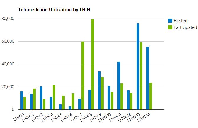
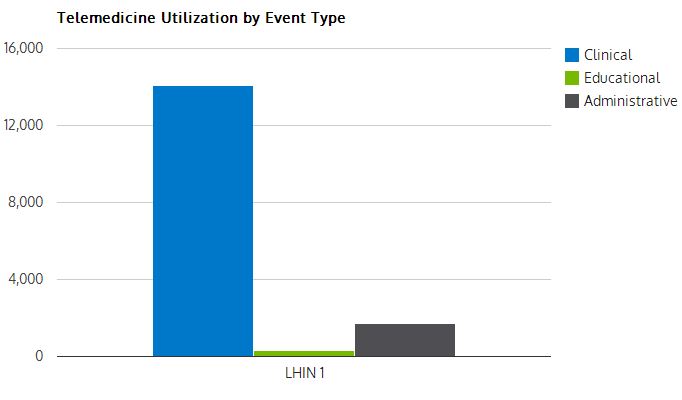
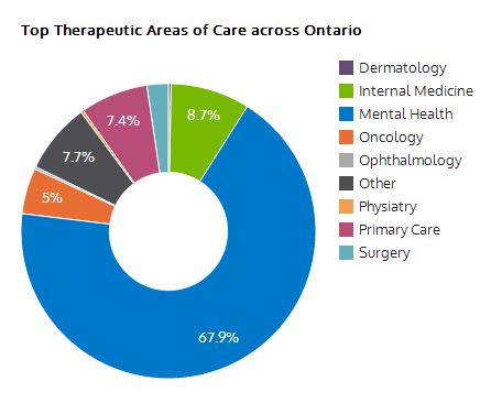
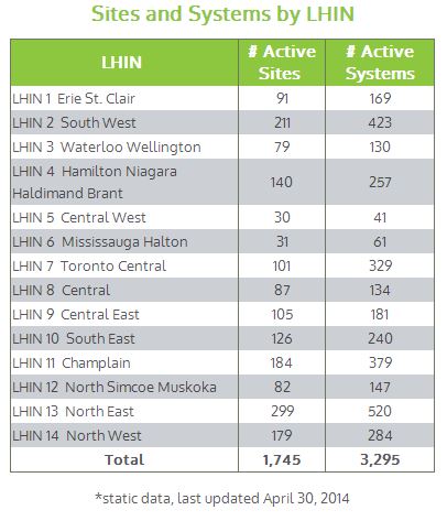
Have you and your telemedicine colleagues ever wondered how often you use telemedicine compared to other areas of the province? Or how much telemedicine activity occurred in one LHIN versus another LHIN? Or what kinds of therapeutic areas of care were most popular over OTN’s network?
We’ve revamped the way we present our provincial and LHIN data to include historical information that can be displayed in a series of interactive Google Charts. Here’s a quick overview of what you can see with our new interactive LHIN charts (click to view):
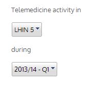 Using the dropdown menu on the left column of the page you can select what LHIN you’d like to see the data from and during which quarter. Clicking on a bar or slice from a chart will reveal detailed data. Information on the page is updated shortly after the end of each quarter.
If you’d like to be notified when new data is available subscribe to OTN Update, our monthly e-newsletter, where we’ll include a notice when new data is available. Enjoy!


